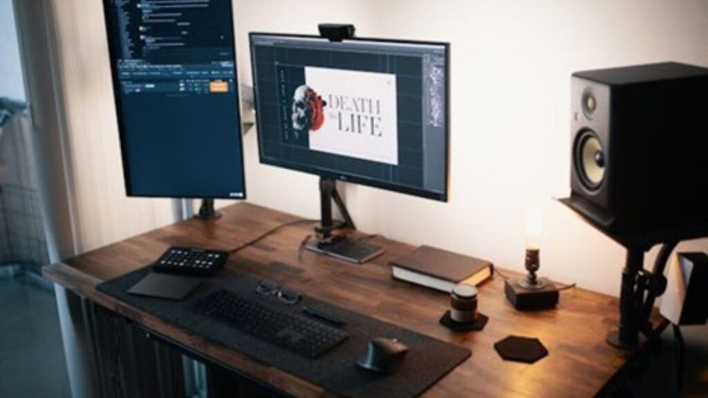
Let’s face it: in our digital world, a profile picture is more than just a photo—it’s a key player in your personal and professional branding arsenal. This little image can make a big impression, setting the stage for your perception across various online platforms.
Whether you’re networking, job hunting, or just trying to make a splash on social media, a sharp profile picture is your first chance to catch someone’s eye.
To craft something truly outstanding, we’re turning to the pros: Adobe’s powerhouse trio—Photoshop, Illustrator, and Lightroom.
These tools are the heavyweights of image editing, offering unmatched features that elevate your profile pic from meh to mesmerizing.
Ready to dive in and design a profile picture that’s as polished as you are? Let’s get started with some Adobe magic!
Essential Tools and Settings in Adobe Photoshop
Diving into Adobe Photoshop can be like stepping into a digital artist’s studio—there are tools for everything! But let’s focus on the essentials that’ll take your profile pic to the next level. First up, the Brush, Clone Stamp, and Healing Brush tools are your go-to for perfecting your photo. These tools help clean up blemishes, smooth out inconsistencies, and polish your appearance without needing a glam squad.
Next, let’s talk about layers. Using layers is like having an unlimited safety net. They allow you to make changes without altering the original image directly—you can experiment without any worries. To get your image right, you can adjust their settings, such as opacity and blending modes.

Selection tools are another game-changer. They help you isolate parts of your image for specific edits—like tweaking the background or your shirt color. And for that final touch? Dive into the basic adjustments. Here, you can tweak the brightness, contrast, saturation, and more to ensure your image looks natural yet eye-catching. These fundamental tools and settings in Photoshop are all about giving you control to ensure your profile picture is nothing short of impressive.
Design Principles for Profile Pictures
Nailing the perfect profile picture is all about mastering the basics of composition and design. Start with the rule of thirds—this classic photography principle involves dividing your image into a grid of nine equal segments. Placing the focal point (that’s you!) along these lines or their intersections makes the photo more balanced and pleasing.
When framing, ensure there’s just enough background to add context without distracting from the main show—you. Also, think about the colors and textures in your shot. Choosing colors that complement your complexion and attire can enhance your overall appearance. Textures, whether a brick wall or a soft curtain, should support the vibe you’re going for without overwhelming the scene.
When chosen thoughtfully, these elements can significantly boost the visual impact of your profile picture, making it not just seen but memorable.
Advanced Photoshop Techniques
Ready to transform your profile picture from good to absolutely eye-catching? Let’s explore some advanced Photoshop techniques that can really set your image apart. First, 3D transformations. This cool feature lets you add depth and movement to your image, giving a flat photo some dynamic flair. Imagine subtly rotating your photo for that perfect angle that catches the light just right or adding a shadow effect that makes you pop off the screen.
Masking is another powerful tool in your Photoshop arsenal. It allows for complex edits that can truly customize your image. Want to change the background? Layer a mask over it and blend your portrait seamlessly into a new scenic backdrop or a solid color that matches your brand.
Now, dive into Photoshop’s vast array of filters and effects for a touch of creativity. These can add texture, adjust mood, or even cartoonize your look for something fun on social platforms like Snapchat or Instagram. Websites like GraphicMama and Creative Bloq are treasure troves of tutorials and insights that can inspire you to experiment with different styles and effects. So, roll up your sleeves and let your creative flag fly to make a profile picture as unique as yours!
Using Templates and Presets
Adobe’s preset templates are a secret weapon for quickly whipping up professional-quality profile pictures. These templates are designed with various styles and are easily customizable to align with your personal or brand identity.
Whether you’re going for a sleek, corporate look or something more vibrant and creative, Adobe has you covered. To make a template your own, you can tweak elements like color schemes, fonts, and graphics.

And if you’re looking for a quicker start, by using a profile pic generator creates a stylish and unique profile picture in minutes. Dive into Adobe’s resources to see practical examples of how these templates can be adjusted to meet specific branding needs—ensuring your profile picture looks professional and truly represents who you are.
Lighting and Background Tips
Lighting can make or break your profile picture. For the most flattering results, aim to use natural light whenever possible. It softens your features and brings out your true colors without the harsh shadows that artificial lighting can create.
Position yourself so the light falls evenly, ideally during the morning or late afternoon when the light is softer. When it comes to choosing a background, simplicity is key. Opt for backgrounds that complement and don’t compete with you as the subject.
A neutral or muted background can enhance focus on you, while a slight blur effect can keep you sharp against a softer backdrop. Adobe offers many tips on selecting the right backgrounds to ensure your profile picture engages and captivates at first glance.
Integrating Adobe Tools
To elevate your profile picture to professional levels, integrating multiple Adobe tools can be a game-changer. Start with Lightroom for that flawless finish; it’s perfect for detailed photo retouching and sophisticated color grading.
Adjust lighting, fine-tune contrast, and enhance colors to ensure your image looks exactly how you envision it—polished and vibrant.
Then, switch gears to Illustrator to add those crisp vector elements. Incorporating logos or smart text overlays can significantly enhance the professional appearance of your profile image.
These tools work together seamlessly, allowing you to create a cohesive and impactful visual identity that stands out in any digital crowd.
Final Touches and Exporting
Before you export your newly crafted profile picture, take a moment to ensure it aligns perfectly with your intended branding. Does it convey the right professional or personal vibe? Check it on different devices to ensure it looks good on small phone screens and larger desktop displays.
When exporting, consider the specific requirements of each social media platform. Use PNG for higher quality or JPEG for a balance of quality and file size.

Adjust the resolution and dimensions according to the platform’s recommendations—usually, a square format works best to maintain clarity and detail on sites like LinkedIn, Facebook, and Instagram. These final checks and tweaks will ensure your profile picture makes the best impression wherever you post it.
Conclusion
A well-crafted profile picture is more than just a placeholder—it’s a powerful personal and professional branding tool. Your visual introduction offers a snapshot of who you are across various digital landscapes. Take the time to experiment with the different techniques provided by Adobe’s Photoshop, Lightroom, and Illustrator to find the style that best captures your essence or enhances your brand. Whether you’re refining your image with advanced edits or incorporating graphic elements that speak to your identity, each adjustment helps create a memorable and engaging profile picture. Dive in, get creative, and let your profile picture tell your story!


